Branding Trends 2026: What Actually Changed | Digital Surgeons

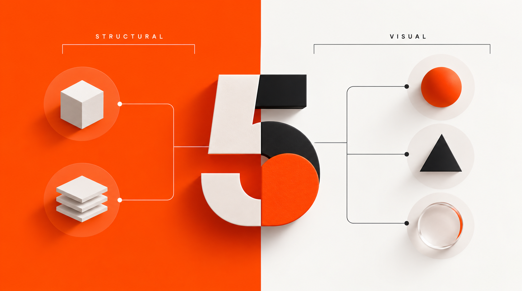
Five things changed in branding this year. Two of them were structural.
Quick answer: The branding trends of 2026 fall into two groups. Three changed how brands look: a retreat from blandification, the return of characters and voice, and a move toward texture and craft. Two changed how brands are made: guidelines became software, and brands picked up a second audience in the machines that now describe them. The second group caused the first.
Every December the trend lists arrive and most of them describe weather. Colours are warmer this year. Serifs are back. Gradients are out, then in again.
None of that is wrong. It is just not very useful, because a mood does not tell you what to do differently on Monday.
So here is how we read 2026 at Digital Surgeons. Five things genuinely shifted. Three of them changed what brands look like. Two of them changed how brands get made, and those two are the reason the other three happened.
1. Brand guidelines stopped being a document
This is the change we will still be talking about in five years.
In July, Coca-Cola launched a refreshed global identity with Jones Knowles Ritchie across more than 200 markets. The visible work was careful and restrained, built around the red and white, the Spencerian script and the Dynamic Ribbon. Most of the commentary went to the script.
The part that mattered shipped alongside it. Project Fizzion, built with Adobe, converts Coca-Cola's guidelines into a machine-readable format they call a StyleID and puts those rules inside Illustrator and Photoshop. A designer works, the system reads what they are doing, the rules apply as they go. Coca-Cola says teams produce work up to ten times faster while staying on brand.
Coca-Cola is not alone in the direction, only in the scale. Frontify, Templafy and others spent the year making the same argument in public: guidelines have to be readable by software, not only by people.
Here is why this arrived now.
The most quoted number in brand consistency is that 81% of organisations still produce off-brand content despite having guidelines. It comes from a Lucidpress survey of more than 400 brand managers. That survey is from 2019, and in seven years nobody has replaced it with anything better, which tells you roughly how much attention the problem was getting.
The reason is uncomfortable. A guidelines document describes a brand. It cannot make anything happen. Every time it gets followed, a person chose to go and look it up, and that person had to know it existed, find it, understand it and have the time. Four conditions, checked at every decision, forever, mostly by people who are not designers.
That was survivable when a brand produced a few hundred assets a year. It stopped being survivable when production volume went up by an order of magnitude.
The shift in 2026 was from describing the rule to installing it.
2. Brands picked up a second audience
For as long as any of us have done this, the job was to be persuasive to a person looking at the brand.
That person increasingly meets a description of you before they meet you.
Someone asks an assistant which companies to consider. Google generates an answer above the results. A model that read your site overnight tells a buyer what you are in three sentences. Roughly two thirds of Google searches now end without a click to any site, and AI Overviews appear on a substantial and growing share of queries.
So a large part of the moment where someone forms an impression of you happens somewhere your homepage is not present.
This has a specific consequence for brand work, and it is not the one people reach for first. The instinct is to say design matters less. That is the wrong read. Humans still decide, and they still respond to craft.
The real consequence is that your brand now has to survive compression. Stripped of layout, stripped of motion, stripped of everything except the words, and reduced to a paragraph by something that is not trying to flatter you.
Most brands fail that in the same way, and it is rarely because the design is bad. It is vagueness. Category language standing in for a position. Claims with no proof attached. A homepage that takes six paragraphs to say what the company does. Case studies that describe activity instead of outcome.
A person forgives all of that, because they have the film, the photography, the founder's energy on a call. A summarisation layer has the text. If the text is imprecise, the summary is generic, and generic is indistinguishable from your competitors.
Which is why structured data quietly became brand infrastructure this year rather than an SEO chore. It is the only part of your site that talks directly to the layer doing the describing.
3. The retreat from blandification
Now the visible stuff.
For most of the last decade, the safe move was to sand everything down. Geometric sans, generous white space, a soft gradient, a friendly illustration style that looked broadly the same across fintech, healthcare and pet insurance.
2026 was the year the industry started backing out of it. Texture came back. Print and material references came back. Photography that looks like it was taken somewhere specific came back. Templo's work for the paper manufacturer GF Smith got attention precisely because it took risks at a moment when most identity work was still playing safe.
The usual explanation is that trends are a pendulum and minimalism had its turn.
We think the cause is more concrete. When anyone can produce a clean, competent, frictionless-looking asset in ninety seconds, clean and competent stops being evidence of anything. It used to signal that a company had taste and could afford good people. Now it signals a prompt.
Texture is expensive to fake. So is specificity. Trend number three is a direct consequence of trend number two.
4. Characters came back, and so did voice
Mascots spent twenty years being treated as slightly embarrassing. That ended.
Duolingo is the case everyone points to, and fairly. When they staged the death of their owl, it produced around 169,000 mentions and 1.7 billion impressions, more conversation than the top Super Bowl advertising of that year. Not because the illustration was good. Because the character had a consistent point of view and people wanted to see what it would do next.
Mailchimp's Freddie is the longer-running version of the same idea. He never got corrected into generic SaaS politeness, so he still means something.
Tinder's rebrand this year, by Porto Rocha, extended the idea past illustration. Alongside the visual work they introduced a fictional dating columnist called T, written to sound like a friend who has already been through it, and let that voice carry the brand's point of view. The imagery ran anime screenshots and oil paintings next to ordinary couple photography.
Whatever you make of the execution, the strategic instinct is the right one. A character is the hardest thing for a machine to imitate convincingly, because consistency of personality across hundreds of small decisions is exactly where generated work falls apart.
The strongest character programmes we saw this year were not campaign assets. They were running across onboarding, empty states, error messages, feature launches and social, holding one personality the whole way through.
5. Companies started pricing the undo
The last one is less visible than the others and we may be early in calling it, but the year gave the industry an expensive lesson in it.
Two of the most discussed brand changes of the last eighteen months had very different outcomes, and the difference was not the quality of the design.
Cracker Barrel changed its logo in August 2025 and reversed within days. The episode was costly. Reporting at the time put the market value lost near $100 million, the stock recovered around 7% on the reversal, and the trading damage carried well into fiscal 2026, with first quarter revenue down 5.7% and comparable restaurant sales down 4.7%. The CEO stepped down in August 2026.
Jaguar took a different path. The identity work in November 2024 was deliberate and well-crafted, and the underlying strategy is defensible. A heritage marque moving to a new buyer and an all-electric range was never going to get there by half measures. European registrations in April 2025 came in at 49 against 1,961 a year earlier, which the company attributes to a planned sunset of the existing range ahead of relaunch. The production reveal has since moved more than once.
We are not scoring either of these. Both companies had real problems and made real decisions, and hindsight is cheap.
The observation is narrower. Cracker Barrel had a reversal available and used it inside a week. Jaguar's approach committed the product line, which meant the only route forward was through. One of those positions leaves you options in week two and the other does not.
What we noticed across client conversations this year is that the question started getting asked earlier. Not "is this good" but "what does it cost us to go back". That question used to arrive at the end of a process, if at all. In 2026 it started showing up in the brief.
What connects them
The three visible trends are downstream of the two structural ones.
Brands got textured because frictionless stopped being proof of effort. Brands got characters because personality is the thing generated work cannot hold. Brands got specific because a summarisation layer turns vagueness into something worse than being ignored, which is being described wrongly.
The underlying move is the same in all five. Work that used to live in someone's judgment is moving into systems, and the parts that cannot move into systems are becoming where the value sits.
That is not a threat to brand work. It is a fairly clear instruction about which half of it to invest in.
What we would do about it in 2027
Audit whether your brand is machine-readable. Not the whole Coca-Cola build. Start with whether your tokens, templates and structured data exist at all, and whether anything enforces them when nobody is watching.
Read your own homepage as text. Strip the design and the imagery, then see whether the words still say something specific. If you cannot tell what the company does from the words alone, neither can anything else.
Put proof in text, not only in imagery. Numbers, named clients, outcomes. Beautiful case study photography is invisible to the layer that now describes you.
Give the brand a point of view someone could recognise blind. A character is one way. A voice with actual opinions is another. Both are harder to copy than a colour palette.
Price the reversal before you commit. Ask what going back costs in week two. If the answer is a software update, move quickly. If the answer is eighteen months and a product line, everything upstream of that decision needs to be much better argued.
Frequently asked questions
What are the biggest branding trends in 2026?
Five stood out. Brand guidelines becoming machine-readable software rather than static documents. Brands writing for AI systems that describe them before a human arrives. A retreat from blandification toward texture and craft. The return of characters and distinctive brand voice. And companies treating reversibility as a factor in brand decisions rather than an afterthought.
What is blandification in branding?
Blandification describes the convergence of brand identities on the same safe visual language: geometric sans-serif type, heavy white space, soft gradients and generic illustration. It spread because those choices are low-risk and legible everywhere. It started reversing in 2026, largely because generated work made that look cheap to produce and therefore weak as a signal of quality.
Why are brand mascots making a comeback?
Because personality is difficult to automate. A character holds a consistent point of view across hundreds of small decisions, which is exactly where generated content tends to break down. Duolingo's owl campaign in which the mascot was killed off generated roughly 169,000 mentions and 1.7 billion impressions, more conversation than that year's leading Super Bowl advertising.
What are machine-readable brand guidelines?
They are brand rules expressed in a format software can act on, such as design tokens, structured data and APIs, rather than in a PDF a person has to read and remember. Coca-Cola's Project Fizzion with Adobe is the largest public example, converting their guidelines into a format they call a StyleID that applies inside Illustrator and Photoshop while a designer works.
How does AI search change brand strategy?
It adds a step between your brand and your buyer. A model reads your site and summarises it, and a growing share of searches end without anyone clicking through. That makes precision in your written content a functional requirement rather than a stylistic preference, because a system asked to summarise something vague returns something generic.
Do these trends apply to smaller brands?
The structural ones do, and more cheaply than you would expect. A small company does not need an Adobe partnership to make its brand enforceable. Locked components, a searchable asset library, short usable guidelines and one named owner cover most of it. Writing clearly enough to survive being summarised costs nothing at all.